From Paper to Pixels: Navigating the Evolution of Web Design for Impactful Digital Product


Table of contents
- Rethinking Web Design: Current Issues and Challenges
- Paper vs Box paradigms
- Cross-functional collaboration
- The evolution of coding in a nutshell
- Empowering Non-Coders — Design mental model switch
- Design & Code relationship
- Design-to-code: Auto-Layout & Plugin
- Conclusion
- Navigating the Evolution of Web Design for Accurate Representation and Impactful design involvement in product
Rethinking Web Design: Current Issues and Challenges
In today’s digital landscape, discussions about the origins and evolution of design may not be as present as it once was. While we now have access to modern, digital visual design tools, it’s interesting to note that the core principles have remained largely unchanged since the early days of print. In the past ~5 years the way we design started shifting for good.
Reflecting on the progress made, it’s worth pondering how far web design tools have genuinely advanced in recent years. It seems like each year we are introduced to a new tool that requires further learning. However, it’s worth noting that these new tools, despite their diversity, are increasingly aligned with the fundamental principles of web development. Their aim is to facilitate the translation of designs into intricate, interactive, and cohesive interfaces, keeping the same standards that have shaped the field.
Paper vs Box paradigms
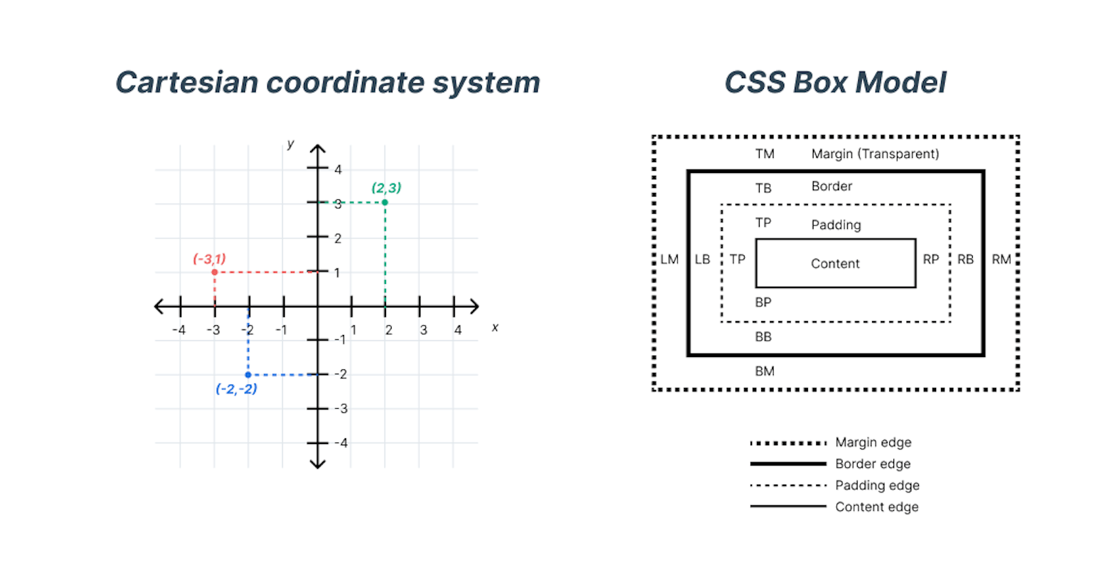
Cartesian coordinate system vs CSS Box Model.
Page or paper paradigm
Most of the tools we used to use in design, were built with the page paradigm in mind — they were based on pixels or vector images developed for print — but the internet doesn’t work this way. Working in an environment essentially different from the final medium may not be the best way to do things.
**Photoshop is the most effective way to show your clients what their websites will never look like.
**Stephen Hay, Creative Director at Rabobank, Author of Responsive Design Workflow
Isn’t it the goal to create a medium-specific design output?
Thinking in paper
Of course in the creative process, prototyping, and proof of concepts anything is valid.
Thinking in a more free-flowing way, open-ended, and starting on a blank sheet of a paper implies a less structured approach, where ideas and concepts are explored and expressed without strict boundaries.
Thinking in “paper” may involve brainstorming, mind mapping, or engaging in creative and loose thinking.
Thinking in boxes
Content: It represents the actual content of the element, such as text, images, or other media.
Padding: The padding is the space between the content and the border of the box. It provides a buffer area around the content.
Border: The border surrounds the padding and content and separates them from neighboring elements. It can have a specific thickness, style, and color.
Margin: The margin is the space between the border of the box and other elements in the layout. It creates a gap or separation between elements.
By understanding and applying the CSS Box Model, web developers can effectively control the sizing, spacing, and positioning of elements on a webpage. Thinking in “boxes” means considering the dimensions and properties of these box-like elements and how they interact with one another.
Cross-functional collaboration

Design, Dev & Content cross-functional collaboration
Achieving Seamless Integration of Design, Content, and Coding
A common downside of a project life-cycle is working on design, content, and coding separately.
Nowadays this is less and less the case, where a designer creates a design that content and developers have to adapt either to the software architecture or to the design and/or vice versa.
The design, however, could be adjusted to our software foundation from the very beginning.
We know that by asking people for their input early in the process, you help them feel invested in the outcome, and the final delivery of a quality product. This is one of the many aspects of why design, content, and development teams have evolved to become more cross-functional and collaborative.
Many designers and developers are also individually becoming more cross-functional with designers learning the basics of HTML, CSS, and Javascript to prototype ideas and developers with a heavy eye for user experience.
Close collaboration between design, marketing, and development teams is crucial for achieving the highest quality products, happy customers, and great companies.
Design-to-code
Designers have ceded too much ground
Brian Chesky (Industrial Designer, CEO & Co-founder ofAirbnb)
Then, there’s also the moment of the design-to-code, the transition of design assets has to be smooth and integral so that not a single tiny thing is lost or neglected in the process.
Using advanced tools that allow previewing the final results and editing them in real time helps preserve a direct connection to the medium we are trying to reach with our designs.
That way, more complete, consistent, and bigger projects can be achieved, and Designers would make the contribution they should be making, “taking their seats at the table”. That’s why it is crucial we —designers— embed ourselves in every aspect of the process, it should be part of our nature to have a deep understanding of the topic and help identify areas where to improve the product.
The evolution of coding in a nutshell
Enhancing Representation of Complex Design Work
As creative professionals, we work with tools and we think in pages while the thing we’re actually working on is far more complex and specific in its final form. So wouldn’t it be more reasonable to find a way to better represent our design work?
Coding Designs within the Constraints of HTML’s Early Days
For example, when I started implementing my designs in coding, more than 15 years ago, the flexibility of HTML (as its intended way of structuring documents), was very limited in what we could do to represent more complex designs. Using HTML tags available at the time.
How it’s started
// An extremely simplified view of how we would position elements
// next to each other

<table>
  <tbody>
    <tr>
      <td>Left element</td>
      <td>Right element</td>
    </tr>
  </tbody>
</table>

Table elements
How it evolved
Then the <div> or “content Division” came along…
// An extremely simplified view of how we would position elements
// next to each other
<div>
  <div class=”float-left mr-16”>Left element</div>
  <div class=”float-left  mr-16”>Center element</div>
  <div>Right element</div>
</div>

<style>
  .float-left {
    float: left;
  }
  .mr-16 {
    margin-right: 16px;
  }
</style>

Divs floating left
How is going
Flexbox or grid and other ways as well (columns CSS property)
<div class=”flex gap-4”>
  <div>Left element</div>
  <div>Center element</div>
  <div>Right element</div>
</div>

<style>
  .flex {
   display: flex;
  }
  .gap-4 {
    gap: 16px;
  }
</style>

Div and flexbox/grid
In these examples, thinking in boxes feels like packing things inside a box. When packing a present for a birthday for example, usually the box is sized to contain the present. (unless you are pranking someone to think that something bigger is inside the box)
Or for example when an e-commerce delivery item comes in a box within a smaller box inside another box. With foam padding around it so it does not move and damage the item inside.
In this case, the content is the item, and the box is the div or parent element containing it, and then the rest of the CSS Box Model properties, Padding, Border, and Margin.
Abstraction layer
Design systems have evolved (as much as the code frameworks) to abstraction layers methods that remove the amount of code that has to be read/written/understood by a developer/designer to achieve complex layouts or solve common problems.
For example, the code below could render the example mentioned above but represented in a much simpler way. And a host of other benefits that is out of the scope of this post.
<Inline space=”m”>
  <Text>Left element</Text>
  <Text>Center element</Text>
  <Text>Right element</Text>
</Inline>
Empowering Non-Coders — Design mental model switch
“Paper” model

Open canvas brainstorming post it
“Paper” model

Sketch of dashboard
“Box” model
Mid-fidelity, auto-layout dashboard
From Box Models to Creative Collaboration
Nowadays new tools, like Webflow, Wix, Figma, Adobe XD, Framer, etc., took the initiative to evolve into the box model system.
This enables those who do not code to work on projects at a bigger scale, directly impacting the development stages, and helping us have a say and push for our hypothesis, and new creative solutions.
Modern digital product design is transitioning to where the way of thinking resembles closer to how a code would approach it.
Not to say that the paper model is still going to be a core part of the design.
Free mode vs Systematic (Left side more logical of brain vs right side more creative)
Design & Code relationship

Figma & React components similarity
More and more design is becoming very similar to how a front-end developer would build that design with code, which creates the perfect hand-off for consistency, efficiency, and implementation of a design and removes friction between the designer and the coder.
Of course, this coupled with having a design system on the design side that matches the one used in the coding environment would further remove discrepancies in the final product.
One of the things that’s obviously difficult for a Designer to interpret is exactly what type of code, what type of abstraction layers, and what type of systems you might be using in your development environment.
For more about this topic, I invite you to read my previous article “How to design like a front-end developer — Design Stack & Tech Stack”
Design-to-code: Auto-Layout & Plugin
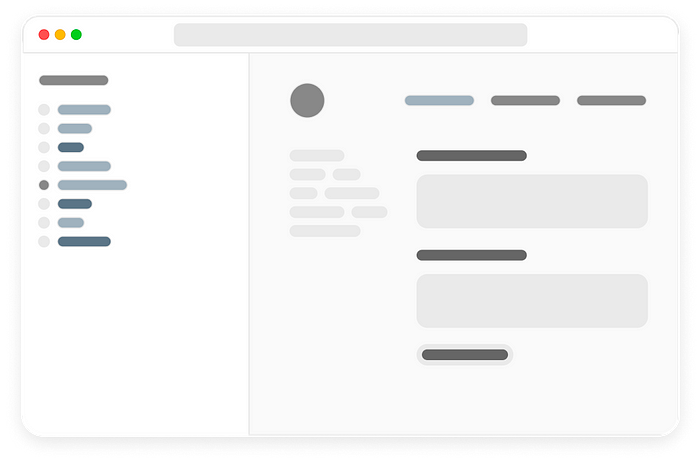
On the following image:
The white box on the left is the layers panel of Figma. Each name has purposely been chosen to match that of each coded design system component at
. The indentation of the layers panel depicts the cascading and nesting of elements. The Card layer is the parent and it has what in programming is called “children” representing each other elements, and those children can also be parents of other elements.
On the right top, we have the actual design of the card, and each layer is one of those elements, spacings, alignments, and content.

In the dark box below we have the abstraction layer of our design system on how we would build the design of the proposed card.
We can immediately see the co-relation of how the ways of designing for the right medium can have its benefits.
For more information about this, I invite you to read my previous article: “Streamlining Design to Code Workflow: How I Created a Figma Plugin to Convert Designs into ReactJS Design System Components”
Conclusion
Navigating the Evolution of Web Design for Accurate Representation and Impactful design involvement in product
As web design continues to evolve, the need for representing complex design work more accurately becomes increasingly apparent. Creative professionals must explore ways to bridge the gap between their tools and the final form of their work. Striking a balance between the freedom of creative expression and the systematic thinking of the box model approach can lead to more complete and consistent design projects.
In conclusion, embracing the evolution of web design, fostering cross-functional collaboration, and finding ways to better represent design work are crucial steps toward achieving high-quality, impactful digital products. By adapting to new tools and methodologies, breaking down silos, and nurturing a collaborative mindset, designers can play an instrumental role in shaping the future of web design.